IRON DUKE HOTEL

Re-branding of the Iron Duke Hotel
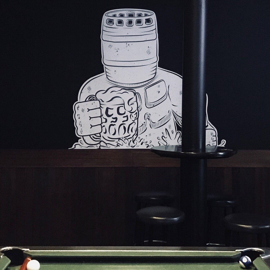
The focus here was to highlight the Hotel’s lushes Beer Garden in contrast with it’s industrial location. I was responsible for the creation of a logo communicating a good time to be had in a leafy upbeat environment, choosing a strong typeface as a symbol of the hotel’s industrial roots. I had the opportunity to collaborate with Young Henrys Brewery to create a t-shirt design promoting both the Hotel and Brewery. This design was also applied to a large vinyl mural within the hotel. My responsibilities also included poster design, graphics for social media a website redesign and light box signage.

Previous logo

Logo redesign
The hotel was looking for a versatile black and white design that reflected the venue’s evolution since the creation of the original logo, appealing to their current demographic.
Website
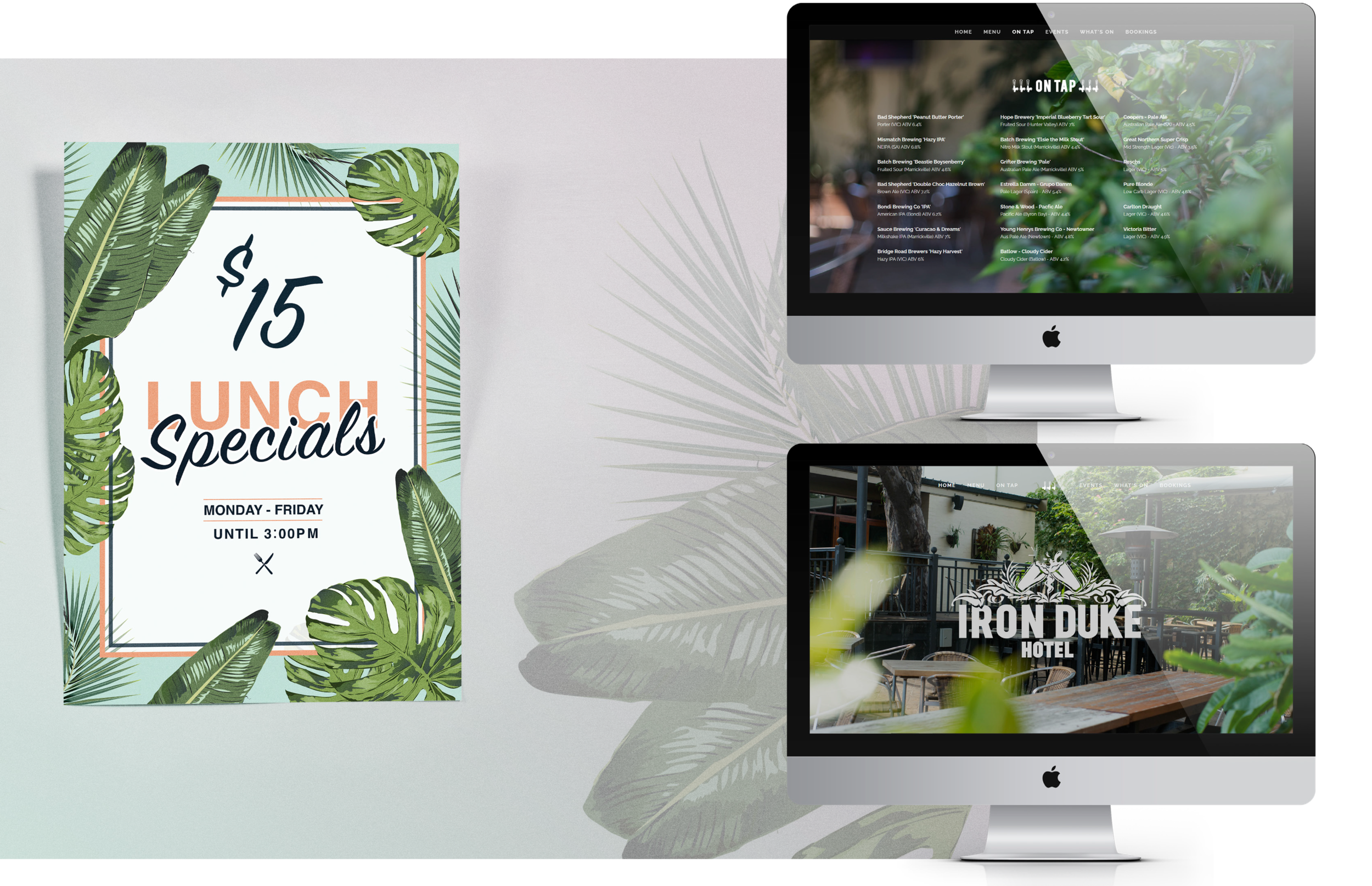
I created digital illustrations and employed sweeping photography showcasing the hotel’s greenery across primary communications and a website redesign using Squarespace to promote the pub as a lushes oasis in which to quench one’s thirst.

T-shirt design and vinyl wall decal featuring a mascot designed in collaboration with Young Henrys brewery.
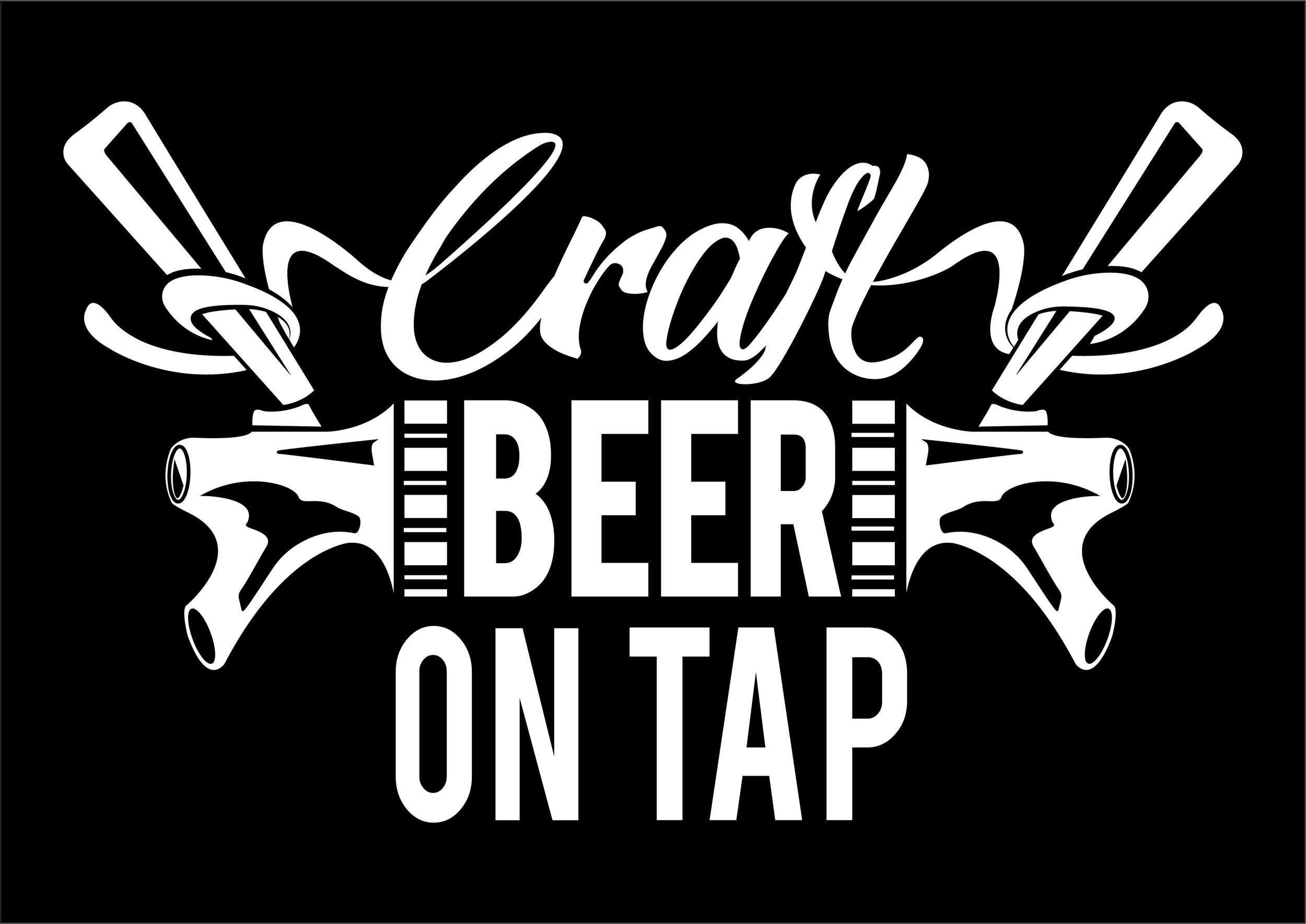
Light box sign advertising craft beer.


